"What should we wear?" - this is a question asked by everyone about to get portraits done. I bet you ask yourself this several times throughout the week; but the "pressure" of putting together a coordinating wardrobe for a portrait session can definitely get even the most fashionable of fashionistas scratching their heads.
Personally, I like to schedule pre-session consultations with my families so that we have the opportunity to talk in person and get some thoughts going. I also like to "pin" examples on my Pinterest boards as points of reference for them, and encourage families to text or e-mail me with what they have decided on. Knowing what colors and style (casual, super-glam, trendy, etc) are going to be worn prior to the session helps me get a better sense of what locations, "posing", and other compositional elements will work best for that particular series of images.
In thinking about how to approach this "what to wear" post, it occurred to me that the majority of people know what they are comfortable in and what makes them feel their best. If you're a jeans, sweater & boots kinda gal then you're going to gravitate towards that style for your session. If dresses and heels are more your "I feel fabulous" look, then same thing. You will feel the best dressing in the style that you feel the best in, and that will reflect in your portraits. And your portraits will look equally as awesome weather you're in jeans and a sweater or killer heels and a dress...it's about your personality and letting that shine. So, the question I'm going address in this post isn't really what to wear, it's more how to coordinate your family's looks.
I personally prefer to photograph families in coordinating looks, not "matching" outfits of the same exact sweater or color top. These color tips are being geared towards a family/couple session, where a unified look is needed to tie everyone together. You want your wardrobe to show your personalities, but it also needs to work with the composition your photographer is going to be creating - one person in too bold of a color or pattern can work against a composition; it can draw the attention to that one person and/or overpower the beautiful faces that are supposed to be the focal point.
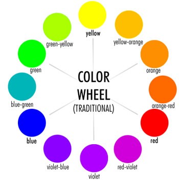
The Color Wheel: a quick review
The traditional color wheel consists of three sets of colors: Primary, Secondary, & Tertiary. Understanding these colors and how they related to each other will be helpful in choosing a color palatte to accent your portraits.
Primary Colors: Red, Yellow & Blue are the three primary colors. It is from these colors that all other colors are made.
Secondary Colors: Violet, green, & orange are made by mixing two primary colors together. Red + Blue = Violet, Blue + Yellow = Green, and Yellow + Red = Orange. Each secondary colors falls between the two primary colors that create it on the wheel.
Tertiary Colors: Mixing together a Primary & Secondary color yields a "third" (tertiary) color. When naming this color, the primary color should always be named first. Red + Violet = Blue-Violet; Yellow + Orange = Yellow-Orange, etc. Just as with the secondary colors, each tertiary color falls between the two colors that create it on the color wheel.
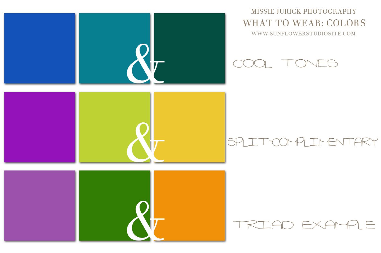
Color Harmonies:
Complimentary Colors: any two colors directly opposite each other on the color wheel. Ex: yellow & violet, red & green, blue-green & red-orange. These two colors used together will be very vibrant, with a lot of contrast.
Analagous Colors: Analagous means "next to." Any two colors next to each other are analagous. Red & red-violet, blue & blue-green, yellow & yellow-orange are examples. For design/wardrobe purposes, you most likely would pick three colors analagous to each other and use a grey to tie them all together. These colors are typically found in nature, and are very harmonious and pleasing to the eye. To add some contrast, use two or three colors and add grey to accent.
Triad Colors: Three colors evenly spaced on the color wheel make up a triad. For example: Violet, Green & Orange. These colors will create a very vibrant effect. Use one color as the dominate, the other two as accents.
Split-Complimentary: One color, plus the colors on either side of its compliment. (think of an acute triangle) An example would be Violet, Yellow-green, & yellow-orange. This creates strong contrast, but with less "tension" than in a triad.
Color Families:
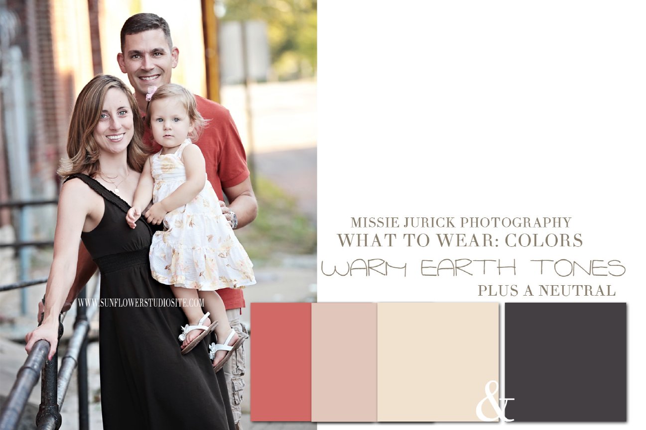
Warm Colors: Reds, oranges, yellows & their various tints & tones. Warm colors typically are associated with feelings of warmth, energy, passion, creativity, and hope.
Cool Colors: Blues, violets, & greens and their various tints & tones. Cool tones are associated with nature, relaxation, and calmness.
Neutral Tones: mix together all three primary colors, and you'll get a shade of brown. Because it has elements of all the colors in it, it is a neutral color. Depending on if you use the science behind color or the additive or substractive color theory, there are agruments over if white & black are each considered a color. For this post's purpose I will skip all that and just say the shades of grey created by mixing these two together is another neutral tone.
So, how will this help you?
Let's say your family is going to have an outdoor session, and you'll be downtown using distressed red walls & doors. Looking at the color wheel, you'll see that green is the complimentary color to red. If you wanted a high-contrast look, then shades of green would workas the main color for your wardrobe.
This high of a contrast may be a bit too strong for your liking, or a bit too "Christmas" in feeling. To tone that down a bit, you could look at the color wheel and decide to go with a split-complimentary color palatte. Using the color on either side of green - yellow-green & blue-green - will create a lot less "tension" between the colors.
You could also look at the colors next to red; an analagous color palatte would pair red-violet with it. To keep it toned down, you could add violet, and add contrast with grey. A grey sweater for Dad, grey boots on Mom, a grey scarf and flower hair accent on sister, and grey plaid shirt on brother puts the accent tone on various levels throughout the family, which will create a nice "flow" to the portraits. A sweater in a shade of violet for Mom, and a dress or denim skirt/top combo with violets for sister, with jeans on Dad, Mom, & Brother creates a unified look. The violets, greys, and blue of the denim will "pop" nicely against the red distressed walls.
If you have a session in a more rural location, with nature's earthy tones and fall colors, then a predominately neutral palatte - grey, for example - will contrast nicely to the beautiful colors surrounding you.
By understanding the relationships between colors, you'll be able to create a cohesive look for your family that will also create balance and "flow" in the composition of your portraits. Accents of a neutral or color varied throughout your family will make the eye travel around the portrait, keeping the emphasis equal on everyone and not overpowering you beautiful smiling faces.
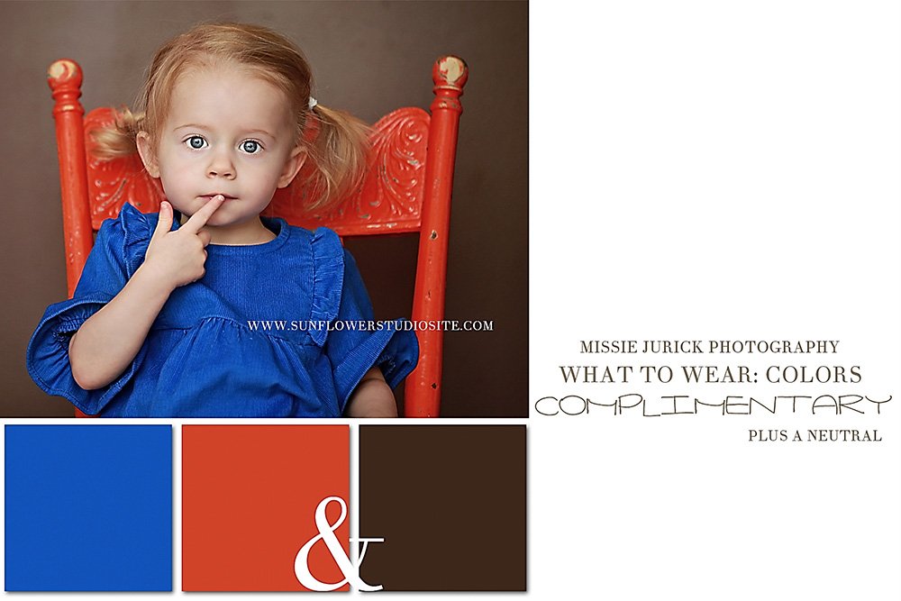
These two examples both demonstrate a complimentary color scheme, however one is much more vibrant than the other because it uses the colors in its purest form. The other example, showing violet and yellow, variations of the colors to create a softer feel.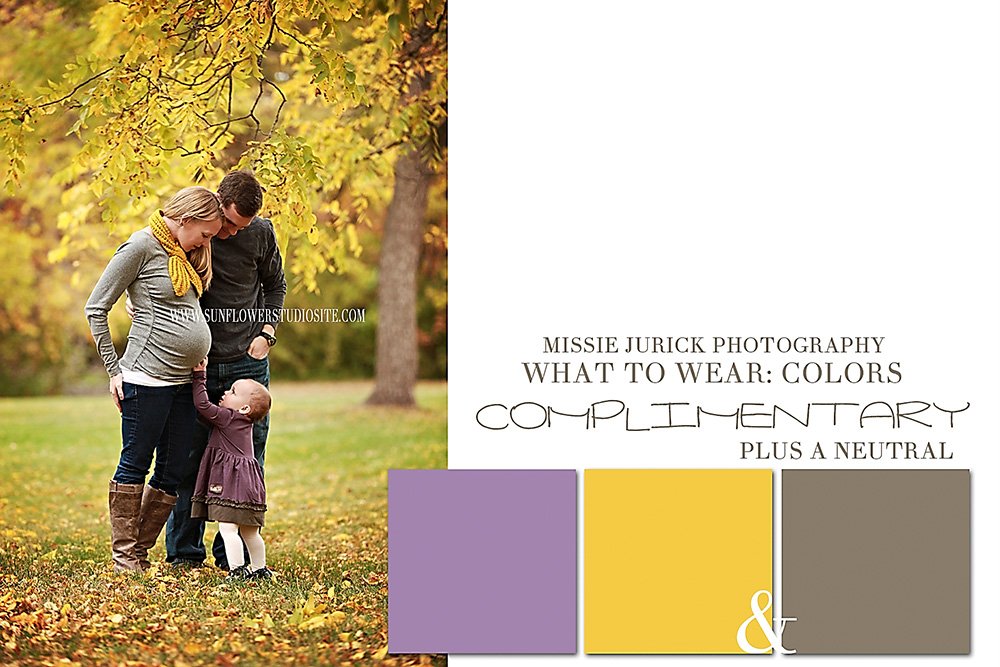
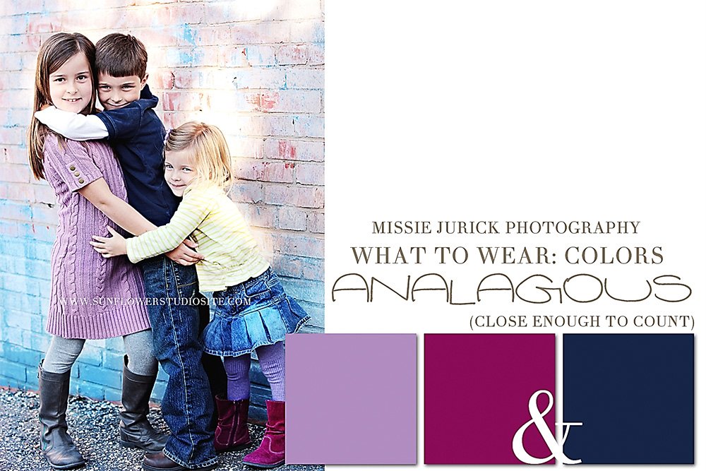 ok, so technically this one above is not a true example of an analagous color scheme, but as they say "close enough for government work!" If the red-violet were replaced with a blue-violet then this would be a true example, but these still work in harmony together....
Below are a few more examples of the various color schemes. These may be a bit too vibrant for you; I picked clear examples to use. Pick a neutral color to use as your main color, then accent with one color; or pick a color scheme and use one main color with a neutral, and accent with the other two colors in small amounts.